Stuart Harrison
PAPER for SAHANZ 2004
‘Words on Buildings’
ABSTRACT:
The paper will examine the role of text on buildings
and the motivations and architectural consequences of this approach.
Citing Labrouste’s Library Saint-Genevieve as an
original precedent, the study will examine the Marion Cultural Centre by Ashton
Raggatt McDougall (
Both the associative meanings and the architectural
devices of text as façade treatment are of interest; the apparent dumbness of
the strategy is belied by such significant architects using the technique from
time to time; which in addition to the aforementioned includes Frank Gehry (Santa
Monica Place), Fredrick Romberg (ETA Factory) and Robert Venturi.
The degree to which architectural words are readable
is of interest – if the word is clearly readable does the building adopt a more
public role? The limits of legibility,
using Neil Levine as starting point, are to be discussed through the mentioned
projects in particular the ARM building.
How is the treatment as cited different to
signage? Do words substitute for an
architectural language no longer readable to most? How is the word
architecturalised?
ILLUSTRATIONS:
1.
Comparison of
Words on the Commercial
Leo’s Restaurant,
Photography by
the author, 2000
2.
Photography by
the author, 2004
PAPER
This paper examines the use of words or text as an
architectural treatment on buildings. More particularly it attempts to examine
the public role of this treatment and to examine architectural intentions and
consequences or readings of this.
Writing was at
one time written into stone (rather than paper or electronically), and used to
record important cultural information: here we look at some examples that use
text as a part of an architectural language that can be drawn upon. This study
is does not include dates on buildings to record their construction, or
headstones. The use of words or text on buildings is historically referred to
as inscription, as most examples
historically use this as the technique for casting words onto buildings.
At the core of this investigation is the question of
whether a building can be read as more public if it uses words. Key concepts
are legibility and choice of word(s); and the relationship between the use of a
language of words and a more traditional architectural language perceived to be
unreadable by the population at large. A traditional architectural language
here is considered as the system of culturally embedded forms (such as
Classical porticos and columns, Gothic windows) that can be associated and
reinforce a particular social condition or historical period.
It is important in this paper to distinguish between
the outlined approach and signage. Signage is the adornment of graphic wording
or symbols to convey the function of a building. The buildings of interest here
integrate text into them, which becomes inseparable from the project. This
often takes the form of façade treatment, but can, as in the case of the Marion
Cultural Centre by Ashton Raggatt McDougall, be a formal strategy for the whole
project.
The
Library
Saint Genevieve
The Library Saint Genevieve appears early in
Labrouste’s career and in many ways can be seen as a Venturi-like decorated
shed. A relatively simple rectangular box is adorned with two systems of
language – a simple, evidently applied, classicism, and words adorning the
principal stone band of the building’s first floor. Neil Levine’s analysis of
the building in his essay, The Romantic
Idea of Architectural Legibility: Henri Labrouste and the Neo-Grec proposes
a reading of the building’s façade treatment as thin – in that the surface
treatment of classicism and text is clearly a shallow façade treatment. It is
generally accepted that Labrouste’s romanticism enables him to draw upon
various languages and use them at his disposal, making them evident. The text
is the most literal of these:
The 810 inscribed
names on Labrouste’s library illustrate a democratic all-inclusiveness
…Labrouste’s inscribed panels face an open volume and transcribe onto its
exposed faces the progressive development of historical change. The meaning of
that progress is open to all who can read.[1]
The proportion of people who could read at the time is
considerable less than now; but all users of the building, as it is a library,
would have been able to comprehend the text. Levine also makes clear that
writing, or inscription, was not new in the mid 19th Century; both Boullée and Durand had used text
to replace an Order, as a rhetorical device.[2]
For Labrouste, the use of text was a “less rhetorical form of literary
expression, as revealed in the abstract, rational, and reflexive relationship
between the printed word and its adherent meaning, that was intended to
dominate the architectonic form.”[3]
Spiro Kostof is one of the few writers outside of
Levine to mention the role of writing, or inscription, on the Labrouste
building:
His library of St. Genevieve we admire today for the
metallic elegance of its reading room…But far from being a manifesto of
structural rationalism, Labrouste’s design sought to give literary expression
to the building program, a library of the industrial age. The exposed metal
armature, the historicist masonry shell, and the inscriptions were coordinated
with this in mind.[4]
What separates Labrouste’s Library with other
buildings of the time is however the use of text on it. The semiotics discussed
here are clear: the building is a library, the names of the authors cast into
the façade both represent the texts within and is itself a text: a sort of
index or catalogue than can be read from outside. This accompanied with the
relatively non-hierarchal classical treatment says Public Library. The classicism of the Library
is a subtle one – not a Greek highly centered and symmetrical type; a far more
palazzo Romanesque evenness. Given the lateness of the building, the choice of
style was open to Labrouste, and he does use a Grecian language for another
word-based gateway project.[5]
The simplicity of classicism, if read through a system such as Peter Kohane’s
consideration of Decorum,[6]
would indicate that this building is perhaps utilitarian in nature, public but
not important (it was, as Barry Bergdoll points out, in the shadow of the
nearby Church of Saint Genevieve).[7]
It is possible that Labrouste considers the remaining semiotic work to be
completed by the words on the building. In this sense, the use of words is part
of a strategy. This approach is intended to clearly communicate both the
public-ness of the building and its function.
The decision to add the text, was, according to
Bergdoll, a late one;
As the scaffolding was to come down in August 1848, he
ordered the workmen to carve the names of authors whose works were contained in
the library onto the panels under the reading windows. It was as though the
library catalogue itself generated a new form of architectural ornament.[8]
In a contemporary example, just the word ‘Library’ might
be used, or even ‘Saint Genevieve’, but the intention is clear: text used to
make public the building by extending its contents, that of the bourgeois
library, into openness of the street. The words signify both the role of
building to those who can read and those not; words are generally recognisable
as that which is contained in books by all. Labrouste was attempting to make a
sophisticated modern building that could be understood and read, and was
located within an urban context in which it was not the dominant part. [9]
Modernity
and Text: Romberg
Swiss-trained architect Fredrick Romberg is partly
credited with the design of Australian Pavilion for the 1940 New Zealand
Centennial Exhibition in Wellington. Harriet Edquist argues that “the external
lettering and ornament reflect Swiss practice”.[10]
Nationality, or place, is established by the use of text; and in this case a
map of Australia as well. The design, a mix of a stately classical tendency and
an austere modernity reflect a contemporary sense but do not place the building
– the writing completes the intention.
The original scheme (1957) for the ETA factory by
Grounds Romberg & Boyd (with Romberg acknowledged as primary author) shows
the acronym ETA integrated into the building, the letters sitting within the
infill spaces between the building’s steel frame. Here the letters are flush
with the façade, and do not sit clearly proud of it as in the final (built)
scheme. As the first scheme was not developed to the level of construction
systems it is not possible to determine to what level the characters would have
been integrated into the walling, but the renderings clearly suggest that there
was little formal or material separation between them and the structural frame.
The built scheme features large lightweight letters that have a strong and
distinctive relationship to the main building. Helen Stuckey suggests that the
building was one of the first to use supergraphics in Melbourne.[11]
It can be suggested that the large letters were the intention of the architect
as they appear integrated in the original scheme.
The structural bracing is another ‘character’ on this
façade – it was coloured metallic gold; the ‘ETA’ letters were bright red. Both
elements however clearly brighter than the main façade, together forming a
something like ‘> ETA’, where ‘>’ is the structural cross bracing. The
curtain wall façade represents modernity, the mass produced, suitable for a new
post-war factory and offices. The bracing and text elements communicate both the
name of the company and a strong link to the road, an acknowledgement to the
speed that the building will primarily be viewed at, due to its adjacency to
the major road. Here, the text is used to extend the intentions of the project.
American
Post-Modernity and Text
The use of text has occurred frequently in the work of
Venturi & Scott-Brown. This is usually in two types; the name of the place
and building, such as ‘Trenton Fire Station’ or the name of a company as in the ‘Best’ supermarkets.
Venturi approaches the use of words from both a position similar to signage -
the post-war American commercial vernacular; and the semiotic discussion of
classicism as demonstrated in Complexity and Contradiction.
In this case, the detachment of the text elements from
these Venturi buildings is conceivable - at one level the architects are
including signage as part of their scope of work. This recognises the
importance of signage (and the way buildings are commonly seen) in the modern
city and the ability of the architect to extend their design to include this
vital element. The separation of the words from the Venturi buildings would be
similar to what has occurred at the ETA building – where the letters have been
removed – the project slips back into its context and becomes
undistinguishable.
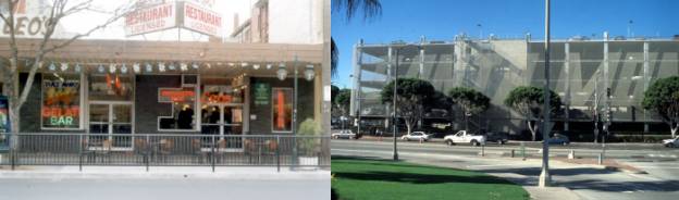
The first stage of Frank Gehry’s independent
architectural practice was based in his home town of Santa Monica, part of the
metropolis of Los Angeles. Living and working in Santa Monica, most of the
early Gehry work is there and in neighbouring Venice Beach. The largest project
in Gehry’s home town was Santa Monica Place, a large shopping centre in
the heart of the suburb. Gehry understood the potential of the type as he had
worked for American shopping centre designer Victor Gruen (who also wrote
numerous books of the topic including Shopping Towns USA). The complex
consists of a suburban internal mall-based centre on a relatively dense site.
The multi-story car-park of the centre is of interest here – one main wall
facing into a primary road into Santa Monica has cast on it ‘SANTA MONICA
PLACE’ in enormous letters. The car-park is of conventional open slab and
column concrete construction – the ends of the floors are open. Gehry adds, as
part of the scheme, a displaced semi-transparent skin, two metres out from the
edge of slab. The space in-between contains occasional stairs – but is
essentially open. The second façade system is of chain link metal loops with
varying densities to mark out the characters. The openness of system continues
to allow natural ventilation into the car-park, but the chain is dense enough
to make the words very readable. Here, the normal hierarchy of shopping centre
pedestrian entry being demarcated as the principal element on the façade is
rejected – the conventionally neglected car-park façade becomes both attractive
and inherently public – all can read it, enter and comprehend it.
Proximity
Leo’s restaurant is a privately owned building with a
public presence. In Fitzroy Street, St. Kilda, it has a façade composed from
brown brick and clear finish aluminum framed glazing. The simple orthogonal
lettering is made with brick, the spaces between the characters and the
different arms of the characters are glazed. The word is not clearly readable,
most people do not tend to notice the letters. This is partly due to the
proximity of the word to the viewer. At the distance from the immediate
footpath only the vernacular of the brick and glazing is readable, but from
across the street when looking toward the shop-front is a view of the word is
clear. Within the restaurant, it is again hard to read the word, through the
interior clutter and in reverse.[12]
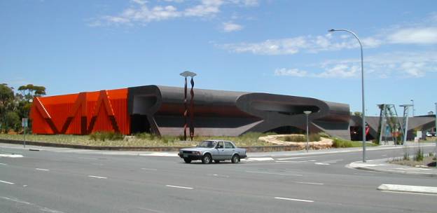
The
Marion Building
Ashton Raggatt McDougall’s (ARM) Marion Cultural
Centre, in suburban Adelaide, uses letters as figured double columns and
arches. The choice of word, ‘MARION’, seems ‘dumb’ or obvious, but it forms a
contextual link to the commercial and public buildings of the area. Several of
the local civic buildings use the word ‘Marion’ in relatively large letters to
locate themselves on a generic late modern architecture. Commercial signage
dominates the road-scape of suburban Adelaide (there are no sign-free freeways
as in other Australian cities). Here, the architects are engaging this suburban
condition, taking onboard the retail vernacular of the large shopping centre
and making it exceptional and generous, the intention to make it public.
The Marion building is sited as a gateway to the very
large Westfield Shopping Centre. In this way it is between the main shopping
centre building and the main road that services it. The Marion building is far
smaller than the shopping centre, which is over several floor levels (the ARM
building is a single level). The building uses its proximity to the road to
make clearer the word MARION as seen from this road. The word is readable in
part from the drive-by experience, but is perhaps more visible when users turn
into the service road and the building comes into directly, in a sweeping
manner. Michael Markham summaries succinctly the architects’ parti,
They
have made a landmark out of the city’s own name, as the designers of roadside
buildings have so unselfconsciously done for half a century now. But this isn’t
a dumb box (to quote the most original architectural thinker of the last 50
years) with a sign out front, or on top; it’s the one pushed into the other.[13]
Only three letters of the word ‘MARION’ are however on
the building, the ‘MAR’. The ‘ION’ is made from landscape features – the ‘I’ a
tall sculpture, the ‘O’ an oval planter bed and the ‘N’ another sculpture. The
‘MAR’ are however treated in the same typeface, but are manifest slightly
differently. The ‘M’ and ‘A’ are formed through a combination of irregular
painted steel boxes and altering depths on vertical steel fins. The solid upper
part of the letters extrude into the Library inside, and are read from the rear
within the library. This extrusion is broken to allow for the full height
glazing and a walk space, enabling the user to walk within these letters.
It is however the ‘R’ that is the most important in
forming a spatial condition and associative language for the project. The ‘R’
is last letter that is part of the building; it is in-between the building and
landscaping. It extrudes down the entire primary side of the building and forms
the main entry into the building and an arcade. The ‘R’ is conceptually
extruded along a curved path running down this edge of the project, but the
treatment to the edge is not consistent as the extrusion is cut in plan. This
truncation results in a mirrored cut ‘R’ and two adjoining arcade spaces. This
space is arcade-esque as the form of the enclosure is effectively arched.
The question of whether the word is readable is of
interest here. Like Leo’s, proximity to the word makes it harder to read. In
the case of Marion, one can occupy the word, and within here a tension exists
between the sensuous form and materiality (of copper and painted timber
battens) and the sense of being within a letter – seeing and R or A around you.
When just outside them, like on the footpath outside Leo’s, the attention is on
the tectonic and materiality of the building; the lapped copper cladding sheets
or the orange painted steel fins; there is nothing to read when at the façade,
only when away from it or within it.
Unlike Leo’s however, the viewer always approaches the
Marion building from a distance, as it
is sited in the middle of a corner lot – that of the
busy Diagonal Road and one of the main entry points to the retail park in which
Marion Westfield Shopping Centre is the dominant part. The word is readable as
the architectural language is intensified
– the use of bright orange painted steel and copper cladding presents
the building as significant.
If the building had used the language of classicism,
the same sense of readability would not occur; (historical) classicism is not
employed for public buildings in the contemporary world – it is now the domain
of large residential work. Classicism is therefore associated with either old
public institutions, like the State Library of Victoria or suburban track
housing; one borrowing from the other. Therefore a new building in the suburbs
(as this one is) would appear more like a house than a public institution if
classicism were used. This is unless the language underwent the sort of
manipulation we see in Venturi’s Seattle Art Museum; and the context was more
traditionally urban.
The architects who have tended to use text or words
are generally interested in a local condition or expression. This is true for
ARM and the early work of Frank Gehry; and in the work of Venturi & Scott
Brown. These same architects also use other devices to denote the local – a
particular (local) vernacular for example.
This can be said of the Marion building. The
vernacular of the shopping centre building is used and then exaggerated. The
black precast concrete walling around the main rear façade of the building uses
the same construction system as most shopping centre perimeter walling. Instead
of this being a more natural colour (typically beige) the dark colour inverts
this (off-black) but is still part of this language. Further exaggeration or
intensification comes from the irregular shape of the panels themselves – they
interlock as per normative precast panels, but register a shift or development
in the module, a minimal move toward figuration, or a registration of movement
at ground level. A bright orange stripe also on this wall is achieved through
both a rough concrete finish to these areas and in its painting in this bright
colour. This undulating line is also a large ‘M’ character, ‘M’ for Marion. The
inset cut into the precast concrete is also a feature of more recent precast
walling at shopping centres – in these cases a token horizontal cut is used to
‘break-up’ the scale of the often imposing blank walls that dominate the
landscape of shopping centre exteriors and car-parks. It is within this context
that the Marion project is located, and satisfies and need for a public
building within the domain of a large privately owned shopping centre.[14]
The identification of place can be seen to be
important here as part of an intention to make a project local. The word
‘Marion’ creates a sense of place, in a place where many architects and
urbanists would feel that this was difficult. Ian McDougall, speaking about the
building at the Victorian RAIA in 2002, talked of an affiliation that the
building attempted with suburban Adelaide where he had grown up. This sense of
place is not akin to that of Norberg-Schultz in an essentialist way, it more
readily accepts the qualities of a place and attempts to make those significant
and public. For example, the carpark at Marion is like many carparks, but it is
a good carpark in that has an attention to its graphic and spatial layout that
makes it also different to the generic. The aforementioned black pre-cast
paneling also works in this way.
The interior and entry sequence of the building is of
interest: the entry, mid-way along the arcade, brings the user into an open
circulation space that is partially filled with a café and very wide steps
leading up to the library (in a manner akin to Michelangelo’s Laurentian
Library). This space shares an affinity in configuration with Roy Ground’s
National Gallery of Victoria in Melbourne – also through the use of the same
vertical panel ceiling system, featured in the original gallery spaces of the
NGV. The building contains the library, a modest gallery and auditorium. The
latter is the most interior of all, with no windows and clad internally with
plywood panels. These stained panels feature many small holes in groupings;
possibly the form of coded text as used on other ARM projects (such as the
Braille on the National Museum of Australia). A more direct symbol is used on
the ceiling, with a two pixilated hands similar to icons of computing operating
system Microsoft Windows touching in a configuration like that of
Michelangelo’s Sistine Chapel ceiling. Here, ARM draw upon imagery and new technology
(both Windows and computer based machine drilled plywood paneling) to
give a readable expression.
In the comparison to Labrouste’s Library we can see
and far more restricted use of words or letters at Marion. Whereas Marion
contains only one word (or just part of), Library Saint Genevieve contains many
names of authors. As suggested before, this is like a book on a building.
Marion eliminates the quantity of words but increases the scale, so that they
can become the main architectural treatment; that which is then rendered with
different material and architectural approaches. Saint Genevieve is more
restrained by comparison. This enlargement of letters at Marion puts them into
a scale directly comparable with columns. Acting vertically and figured they
share the un-abstracted role the column enjoyed prior to Modernity. This is
clear at the front of the Library where the letters are internalized and have a
robustness in both size (they are not thin) and material – welded steel plate
rather than boxed-out plasterboard. This solidity engrains them further into
the project, and they have a role as part of the structure of the building.[15]
The diagonal nature of parts of the letters makes them both raking columns and
bracing; like that used by Romberg at ETA (the structure there was as thin as
possible however).
Memorials often use text to commemorate events, people
and locations of significance and this architectural type contains a certain
specialty that evokes an identification and ownership.[16]
By borrowing from this, the sense of connection from the individual to the
building is achieved in the examples cited; a sense of the public. The ability
to easily decoded and read text on a building forms this connection to a wider
idea; as long as the individual can read English.
Types
and Public-ness
Several main approaches seem to be clear with the use
of words on buildings. Firstly, the word is the place, i.e. ‘MARION’ or ‘SANTA
MONICA PLACE’. Second, the text describes the owner of the building, and is
more like conventional signage, i.e. Leo’s, ETA or Venturi’s BEST supermarkets.
A third grouping contains more coded long phrases, such as the inscription on the Pantheon or the
names of key people involved in a society, such as on Labrouste’s Library.
Another minor group are pavilions such as those in Garden of the Venice
Biennale;[17] national
follies that use one word to indicate the place that they are from, rather than
where they are as in the first group. Here, the written word is used to
complete the intentions of the project that the strictly architectural language
cannot on its own.
Both Labrouste’s Library and ARM’s Marion building use
text as part of a suite of language at their disposal to the same end – to
create a readable public building within an urban context in which they are not
the dominant member. Both buildings use a dominant architectural vernacular,
new technology and words to make the building open conceptually; and therefore
establishing a public role. This is opposed to a physical openness or
transparency – often manifest as large glazed walls in public buildings. Other
projects examined also use words on them to confirm or develop an intention of
the architect; and this is often to expand the building into having clearly
public role. It is clear that the approach of using words on buildings is both
rich and enables users to read and identify the public intentions of the
architect.
Stuart Harrison
stuart.harrison@rmit.edu.au
Endnotes